
Weekend warriors can upgrade their curb appeal in a flash. Spruce up your landscaping, power wash the walkway, replace your mailbox or house numbers, and call it a day. But what about something a little grander? These before-and-after porch projects will show you how to transform your home’s exterior so you can enjoy your home more throughout the summer.
Yellow Brick Home


Yellow Brick Home’s Two Flat renovation is admittedly much more than just a porch upgrade. It just goes to show you how important it is to take the home’s overall style into account when redoing a porch or patio.
In the Before picture, the porch almost looks like an addition gone wrong with that short awning. Extending the porch’s roofline all the way across the exterior gave this house a more refined look and helps make it look complete.
The reconfigured roofline, along with the darker façade, sets the stage for the porch itself. Lighter accents – white for the new steps, porch railings and columns, and red for the door – stand out perfectly.
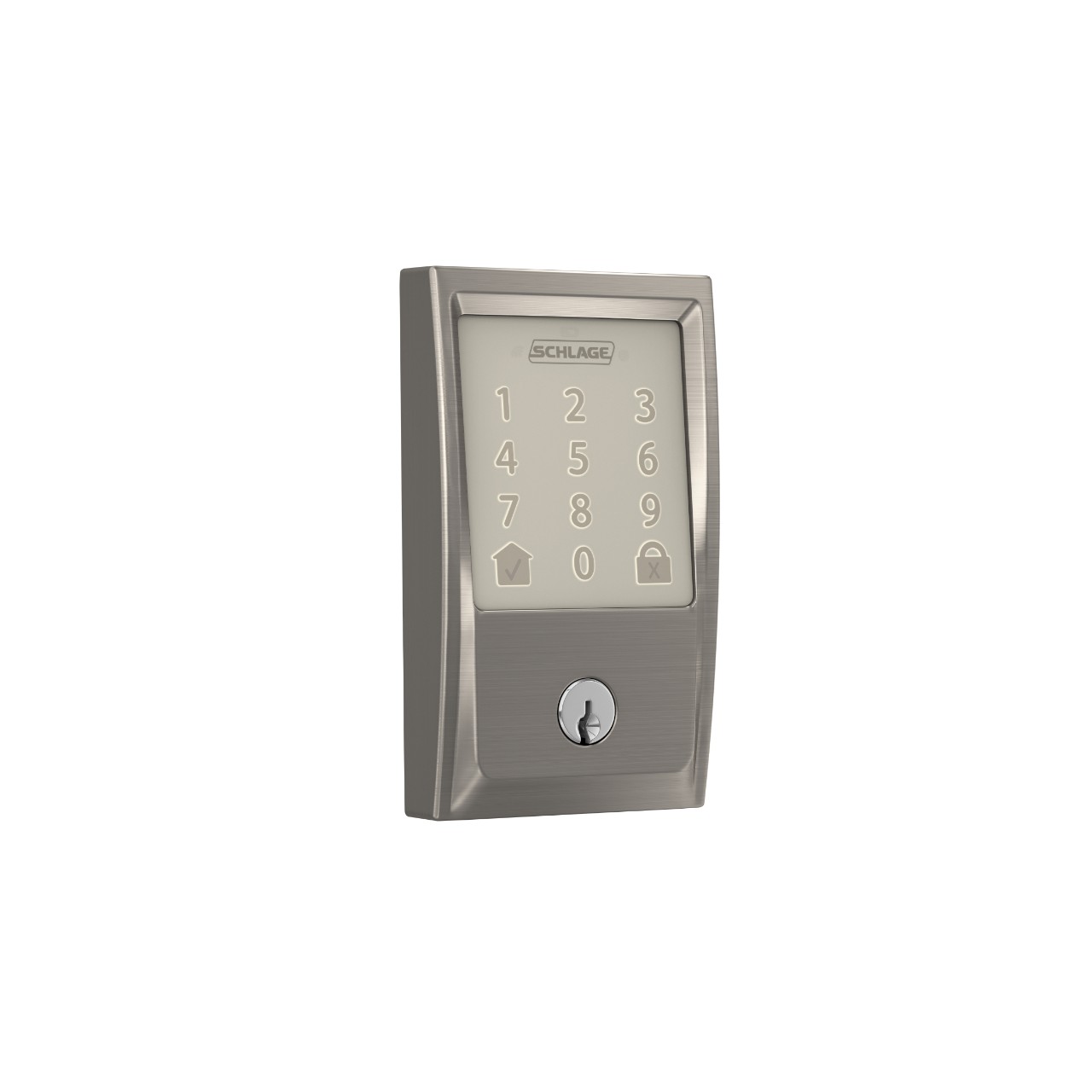
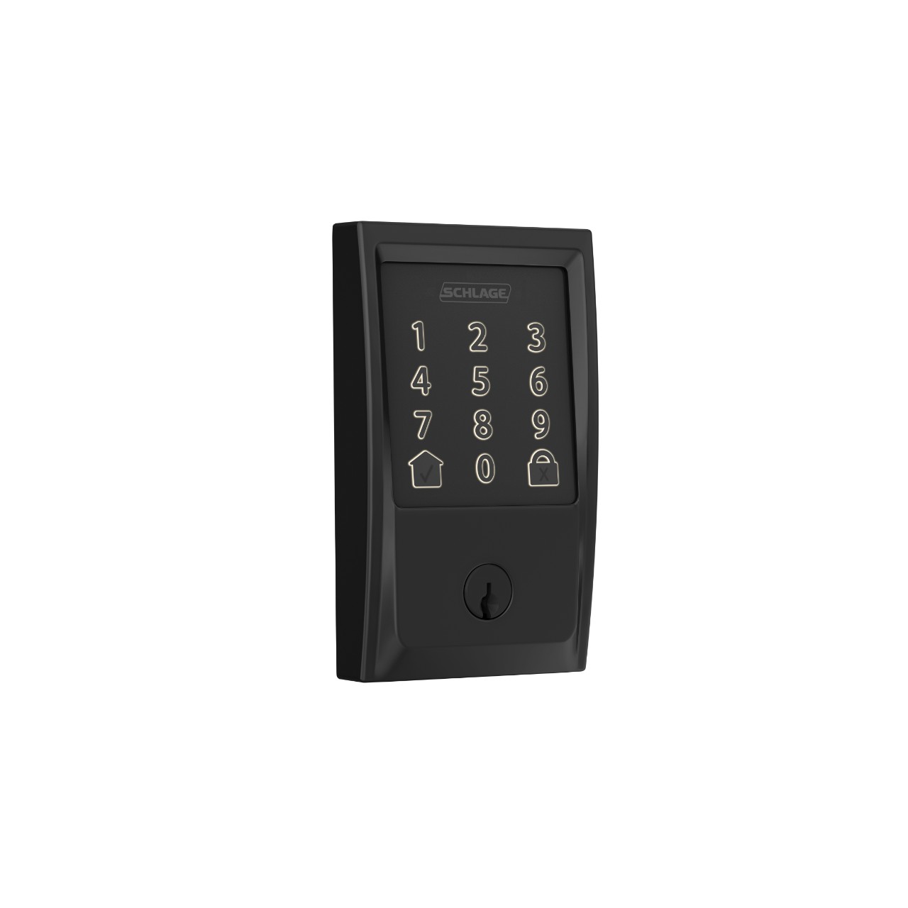
Those railings and columns are the perfect opportunity to talk about stylish safety for your front porch. The railings are a bit higher, which can be important for young families, and the hand rails provide extra stability for those coming and going. Security of the home itself is improved with the Schlage Encode™ Smart WiFi Deadbolt Kim and Scott installed on their bright front door. And the new light fixture to the left of the door itself adds both security and a modern touch. The homeowners mixed metals with a golden finish for the sconce and Matte Black smart lock.
Jenna Sue Design Co


Structurally, not much has changed, and that might be the most amazing part of this front porch makeover. We’d say the biggest transformation are the railings and columns. The dated “swirly metal jail” (her words) were replaced with new wood posts that simultaneously makes the home look more modern and classic. The front door got an overhaul as well. Jenna Sue replaced the glass inset with a simpler pane, painted the door black – one of the hottest colors for entryways in recent years – and installed a Schlage Sense® Smart Deadbolt. The Matte Black finish of the smart lock matches other accents across the home’s exterior, including the lighting fixture, window framing and shutters, again, giving it a timeless look. To cap it all off, Jenna Sue added some fresh landscaping where there was none previously and a pair of rocking chairs. All in all, this front porch has never been more welcoming and suited for hanging out on warm summer nights.
Beginning in the Middle


Before this makeover, we wouldn’t blame you if you drove by this house without even noticing it was there. But with a fresh navy blue paint job and updated porch, you’re now drawn in for all the right reasons.
We love how this porch also shows that you don’t need a lot of room to make a big impact. It’s a small concrete stoop, but by wrapping the posts in PVC trim and matching the light accent colors to the window trim and door, you get a sense of a grander entrance.
A few well-placed and intentionally selected accessories complete the look. New house numbers and matching potted plants flanking the new door are a welcome sight when you come home.
The Ginger Home


This front porch update took The Ginger Home from prefab box to a real charmer. Before, it was just a simple stoop without much to look at. But after, by extending the porch across the front of the house and adding a gabled roof over the door and windows to the left, DIYer Amanda created a statement entrance instead of just a doorway.
We love how the addition of the porch embraced the asymmetry of the home and highlighted it in the best way possible. They did add a side porch to accentuate it as well, but the front porch would have been just as stunning without it.
As with any time you improve front porch décor, the small details make a big difference. The dark front door stands out against the lighter façade and lets guests know exactly where to go when they arrive. A porch swing, beautiful potted plants and sconces near the door invite you to sit and stay a while.
Farmhouse on Boone


Farmhouse modern home exteriors continue to be popular, so when Lisa wanted to revamp her front porch, she was in luck. She already had the true farmhouse. Now she just needed to make it more modern, and she did exactly that by reshaping and recoloring her front porch.
Most notable is the brighter paint scheme. By using white for the house’s exterior, steps, porch railings and columns, and the lighter roof, this homeowner finally has that classic, clean look of modern farmhouse. The natural wood finish on the door, flooring and stair treads also help.
Not only does the brighter color scheme help the porch feel larger and more inviting, but you’ll also see that Lisa switched to spindles on the railing instead of closing it in. People will actually want to laze on the new porch’s seating and enjoy a cool evening breeze.
There was less new construction in this project than you might imagine. The original concrete steps were covered with wood rather than being replaced and the door is the original as well, just stripped of its old paint. It just goes to show you that a stunning transformation could be easier than you think.
Elkins + Co


Goodbye, weird red and pink camo. Hello, gorgeous! There’s a lot to love about this before-and-after, but let’s start with the walls. Jaime Elkins of Elkins + Co. covered the camo with black paint then hung cedar planks. While she admits it’s a more expensive wood, the cedar kept it looking like a rustic pallet wall and gave it a more modern touch.
The natural materials are reflected in other areas of the porch décor as well, including the furniture. The wicker-esque chairs and table helped achieve the Boho vibe they wanted.
And as we’ve seen on many of the porch makeovers already, the dark door accents the rest of the clean, neutral color palette just right. Matching door hardware and light fixtures, a black riser on the single step and floor stenciling help tie everything together.
Life with Neal & Suz


Porches don’t always need to be on the front of your home. In fact, depending on how you plan to use the space, it could fit your lifestyle better to build or upgrade a porch on the side or back of your home. That’s what Neal and Suzanne did when they took their boring concrete slab to an impressive outdoor room.
This porch truly became a place you’d want to lounge. While the fireplace and television help, there’s more to it than those luxuries. The cinder block walls were covered with a faux stone, complementing the natural surroundings of this lake house. The ceiling, made from a reclaimed barn door, adds an earthy warmth, while the tile flooring keeps the space from feeling too rustic. Proof that paying attention to materials and colors can leave you with a balanced look that is both cozy and refined at the same time.
Pretty Handy Girl


Brittany of Pretty Handy Girl added a side porch where there wasn’t one before. As part of her Saving Etta project, she reframed the side of the house, added steps and a porch, another entrance to the home and a storage closet. And she did it all without losing the original character of the old house.
Once the porch was installed, Brittany showed her eye for quality and style by laying Southern Yellow Pine floorboards and stair treads. She then painted the risers the same white as the trim around the doors and window, all ensuring that the materials would hold up to the North Carolina climate and outdoor use.
Of course, we have to mention the doors. The new entryway to the house has a natural wood door, matching the rawness of the salvaged-wood porch ceiling. When Brittany installed the small storage closet to the right of the porch, she used a salvaged door from a nearby property, completing the charming look.


A smaller, but no less stunning, project from Pretty Handy Girl came with her Millie’s Remodel. This is another example of how addressing the entire exterior can make you feel like you’re coming home to, well, a new home.
Rather than replacing the siding or the brick, Brittany painted both the same color of blue to give the house a more cohesive look. It’s also the perfect backdrop for the wooden shutters and darker blue door. And the Schlage smart lock – she installed one on the side porch above, too – adds a stylish touch that brings a new level of security and convenience. Plus, with the slim profile of the Schlage smart lock, it still works with the original storm door.
Surprisingly, not much about the porch itself changed. The iron railings remained, but with landscaping and the new color palette, they seem to fit right in without looking dated anymore. We love how this shows you don’t need a massive budget – Brittany had gone over on the rest of the home’s remodel and was looking to cut costs – to end up with something beautiful.
House Mix


Here’s another small-scale, budget-friendly porch remodel to inspire you. As we’ve seen so many times already, a darker front door can do wonders for freshening up an entryway. It’s a timeless look – both modern and classic at the same time – especially for French doors like Kate has here.
That black door is a great foundation for the other darker accents as well. While House Mix lightened up the wall from its previous beige to off-white, the black door and updated light fixture, and gray stenciled floor and seating show that the details make the difference.
Now that your creative juices are flowing, you’re ready to build a new porch! Turn your home into a relaxing and stylish sanctuary.
Related Products
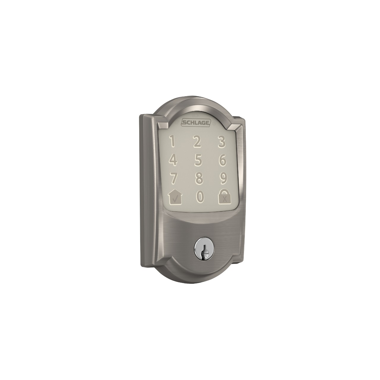
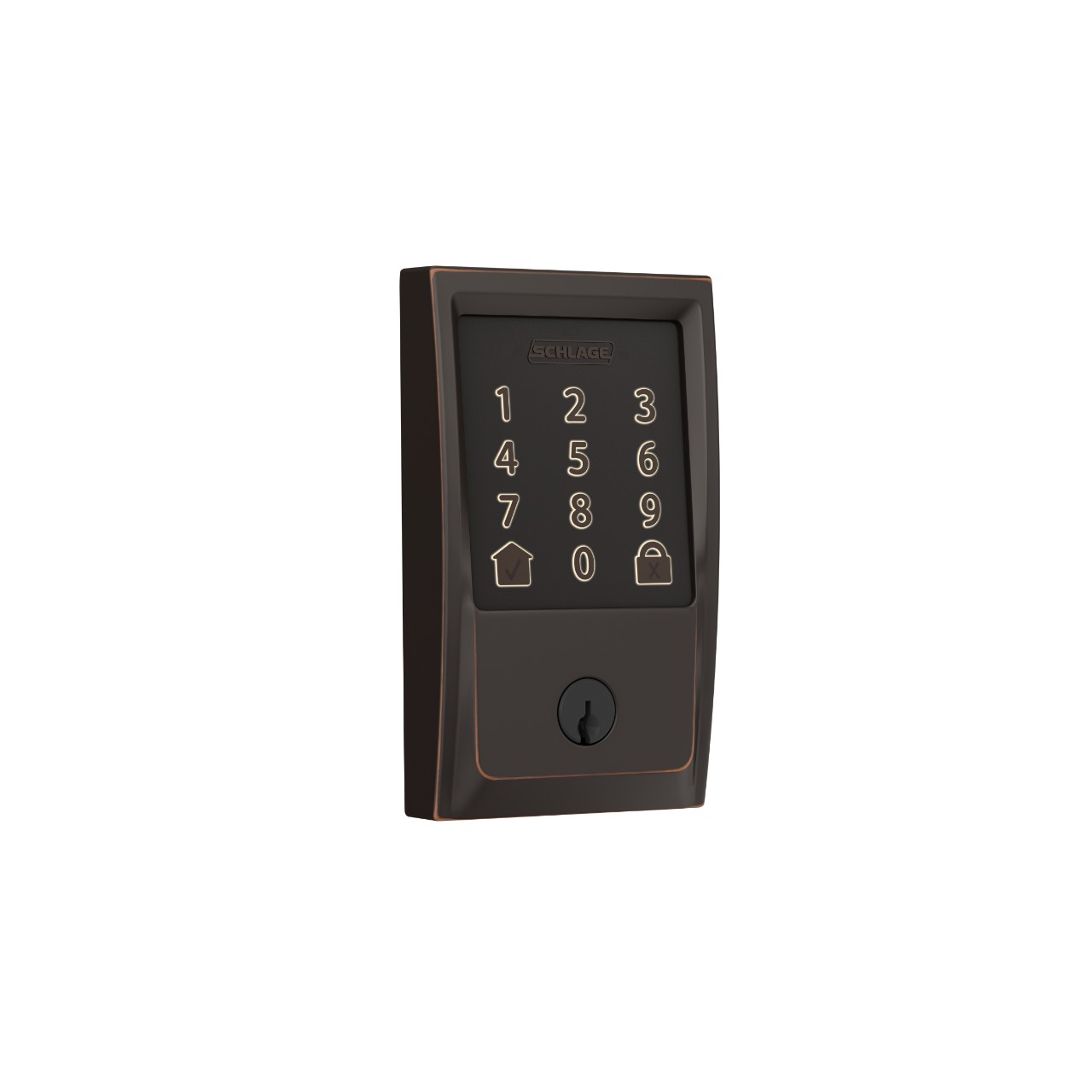
Schlage Encode™ Smart WiFi Deadbolt
Camelot TRIM
From $274.00
From $274.00

Schlage Encode™ Smart WiFi Deadbolt
Century TRIM
From $274.00
From $274.00
Unlock more ideas
Never miss a beat - get the latest product updates, style tips and DIY tutorials sent right to your inbox.

